
A template saves time only when you can change it without breaking its structure. The safest order is content first, links second, visual tokens third and layout last. That order gives each edit a visible result and keeps errors small enough to diagnose.
1. Download and identify the three working layers
Download the free landing-page ZIP below and extract it into a new folder. The project contains index.html, styles.css and app.js. HTML holds the meaning and content, CSS controls appearance and layout, and JavaScript handles the email-form feedback. Keep the original ZIP until your edited copy passes every check.
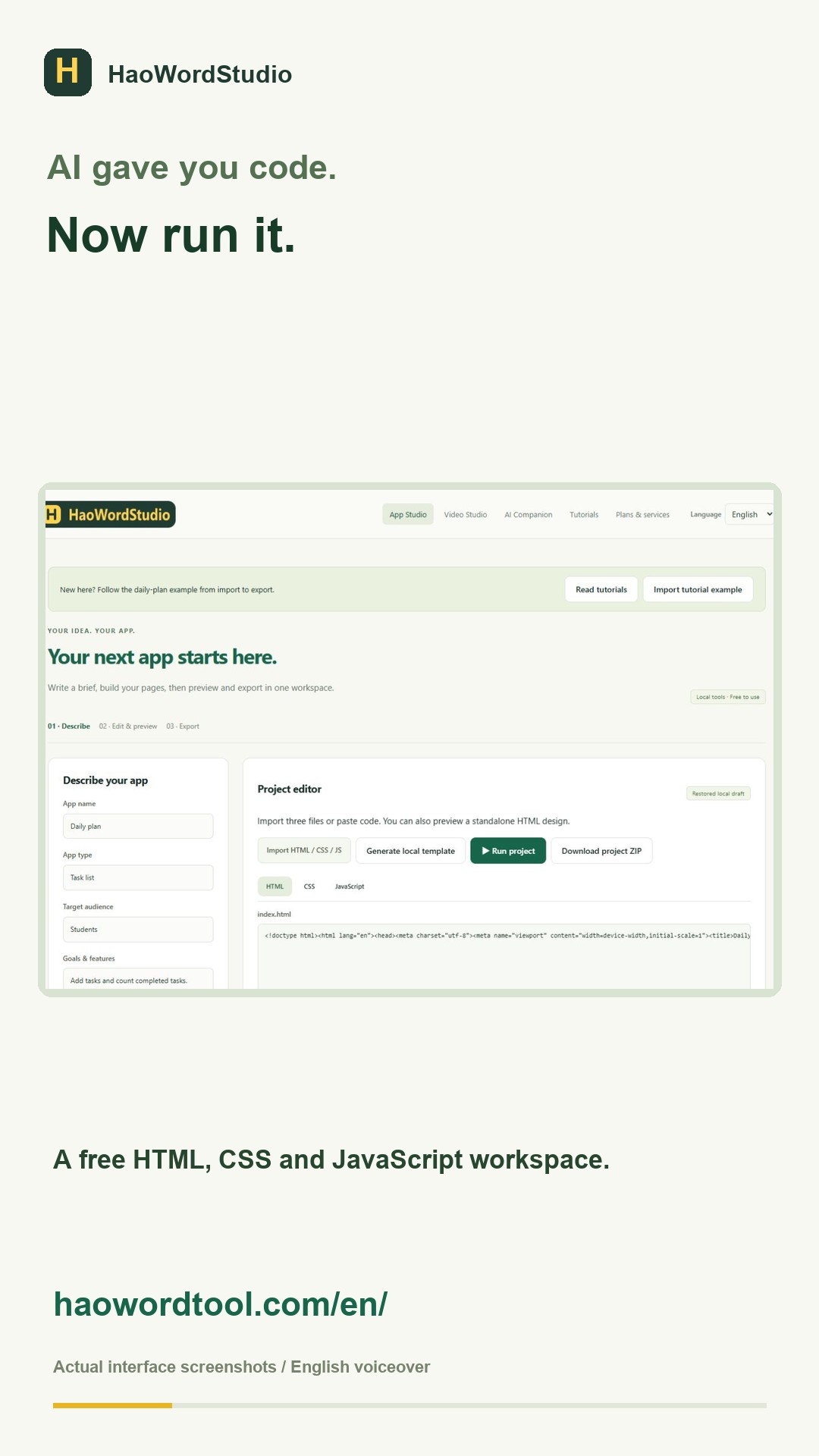
Open the HaoWordStudio workspace and import all three files together. Click Run project. Before editing, confirm that you can see the headline, three feature cards and the email field. Enter an invalid address, then a valid one. Different feedback messages prove that the original JavaScript works.
2. Replace the identity and offer in HTML
Use the HTML tab and search for the current product name. Replace the name in the header, main heading and footer. Then rewrite the supporting paragraph so it answers three questions: who the product is for, what result it provides and what the visitor should do next.
Change one section at a time and run the page after each group of edits. Preserve element names such as id="interest-form" and id="form-status". The JavaScript uses those identifiers to find the form and message area. Visible words are safe to replace; IDs require a matching JavaScript change.
Use a real destination for every link. A call-to-action can point to an order page, a booking page or a contact section. If the destination does not exist yet, use a working contact link instead of leaving href="#". Test each link from the preview.
3. Change colors with a small set of CSS tokens
Open styles.css and identify the repeated background, text and accent colors. Choose one dark text color, one light page color, one main accent and one border color. Replacing a small palette keeps buttons, cards and headings consistent.
Check contrast before adding decorative effects. Button text must remain readable in its normal and hover states. Links should be identifiable without relying on subtle color differences. Avoid changing widths, gaps and font sizes until the new content is in place; longer headings can reveal where layout changes are actually needed.
4. Adapt the form behavior honestly
The free example validates an email and shows a local confirmation. It does not send the address to a server. Edit the confirmation text so it does not promise a subscription or message that the page cannot deliver. For a live mailing list, connect a form provider in the published version and test a real submission using an address you control.
If you do not need the form, remove the entire form section and the related JavaScript listener. Leaving a button that appears to submit but stores nothing creates a misleading page and makes testing harder.
5. Test the mobile layout at 390 pixels
Select the 390px preview. Read the page from top to bottom without zooming. The headline should wrap into complete phrases, buttons should fit within the viewport and card text should not touch the edges. Tab through links and the form to confirm that keyboard focus remains visible.
Use the longest realistic heading and button label during this check. Short placeholder copy often hides problems. If a row becomes crowded, change its mobile CSS to a single column inside the existing media query instead of shrinking the text until it is difficult to read.
6. Export and verify the deliverable
Choose Download project ZIP, extract it into a different folder and open the exported index.html. Confirm that CSS and JavaScript load from the extracted files. Repeat the valid and invalid email checks, open each navigation link and resize the browser window.
A successful editor preview is not the final test. The extracted copy proves that the three file references survived export. If the page loses its styling, check that styles.css sits next to index.html and that the stylesheet filename matches the HTML exactly, including capitalization.
Final acceptance checklist
- The header, headline, offer, button labels and footer use the new identity.
- Every visible link opens the intended destination.
- The form either performs its stated action or clearly describes local-only feedback.
- No text or control extends beyond a 390px viewport.
- The extracted ZIP opens with its styling and interaction intact.
- The project contains no passwords, private keys, analytics secrets or customer data.
When a template is the wrong starting point
A static template is a good fit for a landing page, portfolio, event page or simple brochure site. A login, database, private dashboard, live payment system or native mobile installer needs additional development and security work. Write those requirements down before buying a template so the project format matches the result you need.